Moreover, below the chartjunk lay an important story about resource depletion on our small planet. This story deserved to be told, and so I did. I drew a cleaned and clear version, containing the same data as the original. Here it is. (click on the image to embiggen.)
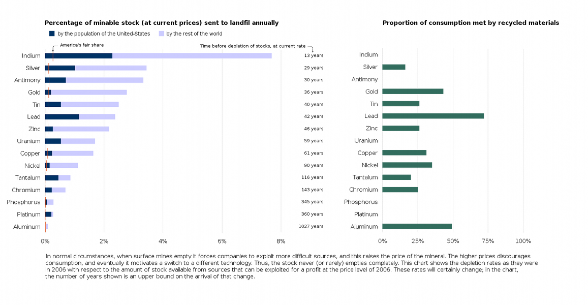
The chart above is my version, and the New Scientist's original is below.

The theory about resource depletion comes from Hubbert's Peak. The theory about chartjunk comes from Tufte's groundbreaking, beautiful, and expensive books (all three of them), as well as from Rafe M.J. Donahue's outstanding free course notes on information design. America's fair share was computed according to one particular definition of 'fair', namely, the current world consumption times the percentage of the world's population living in the US.
3 comments:
"Sent to Landfill"? That's not the same as consumption.
I like your version, yet another perspective and definitely more intuitive than the original. But as all this discussion goes on I am getting more confused about the whole topic of depletion!
Ridiculus, we have only been excavating a few percent of the crust, we got a whole lot of dirt left to extract resources from and then there is always the lumps of metals and dusts that just is waiting to mining in that great void outside of earth's atmosphere.
Post a Comment