Sunday, May 31, 2009
Done! .... Nope! (ha! ha!)
Andrew Trumper posted an excellent analysis of how progress bars are all wrong (and what to do about it).
Saturday, May 30, 2009
The speed, size and dependability of programming languages
The Computer Language Benchmarks Game is a collection of 429 programs, consisting of 13 benchmark reimplemented across 33 programming languages. It is a fantastic resource if you are trying to compare programming languages quantitatively. Which, oddly, very few people seems to be interested in doing.
The Benchmark Game spends a lot of efforts justifying itself against claims that the benchmarks are always flawed and that the whole exercise is pointless. I don't think it is. In fact, I've found that The Game is remarkably effective at predicting which forum hosts programmers annoyed at the slowness of their language, and that's good enough for me.
I was happy to find that in addition to speed The Game also publishes a source-code-size metric for each benchmark programs in each language. Thanks to this The Game let us at explore a fascinating aspect of programming language design: the tension that exist between expressiveness and performance. It is this tension that gives the expression "higher-level programming language" a pejorative connotation. When you are coding this high, you might be writing beautiful code, but you are so far away from the hardware you can't possibly get good performance, right?
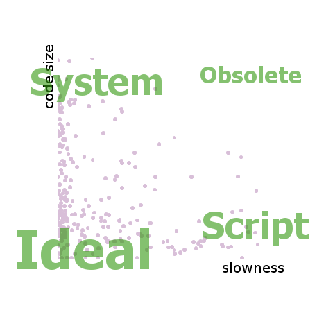
If you drew the benchmark results on an XY chart you could name the four corners. The fast but verbose languages would cluster at the top left. Let's call them system languages. The elegantly concise but sluggish languages would cluster at the bottom right. Let's call them script languages. On the top right you would find the obsolete languages. That is, languages which have since been outclassed by newer languages, unless they offer some quirky attraction that is not captured by the data here. And finally, in the bottom left corner you would find probably nothing, since this is the space of the ideal language, the one which is at the same time fast and short and a joy to use.
Each pinkish dot in this chart comes from one language implementing one benchmark solution, so there are 429 dots, minus a few missing implementations. Both axes show multipliers of worsening from best. That is, if a particular solution is not the best one, the axis show how many times worse it is when compared to the best. The barrier of dots on the left side means that it is common to have many solutions near the best performer. On the right side and beyond it, there are a number of distant points which are clipped out of view by the edge.
The distribution of pink points is more uniform along the Y axis (verbosity) than along the X (slowness), suggesting that the world has not hit a wall in the progression of the expressiveness of programming languages the way it has with performance.
Like many scientific datasets, the data coming from The Computer Language Benchmark Game is rich in shapes, insight and stories. In order to retain as much of the shape as possible, it is critical to avoid calculating averages, as averages tend to smooth over the data and hide interesting sources of variation. The average function does to numbers what Gaussian blur does to pictures. Avoid it if you want to see the edges.
One such source of variation that attracted my curiosity was dependability: how well does the language performs across a variety of tasks, such as those composing the benchmark suite? A language might be concise most of the time, but if once a month a quirk of the language forces the code to be five times as large as what it ought to be, it's a problem.
In order to show dependability, and to avoid relying on averages and standard deviations, I drew star charts in the following manner. Take, for example, the benchmarks for the programming language Scala, which is a mix of functional programming and Java that runs on the JVM. Starting with the previous chart and its 429 dots, I added a gray line from the XY position of each Scala benchmark to the position of the overall average of all the Scala programs.
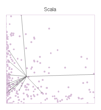
The center of the star is Scala's average performance, and the branches shoot out to the individual benchmarks. The resulting shape says something about Scala. On the X axis (slowness), the points often come close to the left wall, showing that Scala can take advantage of the optimizations done by the JVM. But the performance is not consistent, and in one case the performance is all the way to the right. On the Y axis (code size), we see that most of its scores are amongst the background crowd, but some of the faster benchmarks might have needed convolutions to reach the speed they have, including the one data point off the chart high above.
The next chart arranges the entire collection of the 33 programming languages available at The Computer Language Benchmark Game into a 6x6 grid. The chart is a so-called 'small multiples' design: each swatch in the grid has the same axes in the same scales as each other. It's the same setup as the one for Scala that we just saw. The 429 dots in the background are the same throughout. The intent is to make it easy to compare the shape of the star between languages (across the page), and against the general trend (in the background).
The swatch of the languages are grouped into columns according to their overall performance. Thus the fastest languages are in the first column on the left and the slowest are on the right. Within each column the swatches are sorted by average code size, with the best one at the bottom. In this way, the disposition of the grid mimics the axes within the swatches.
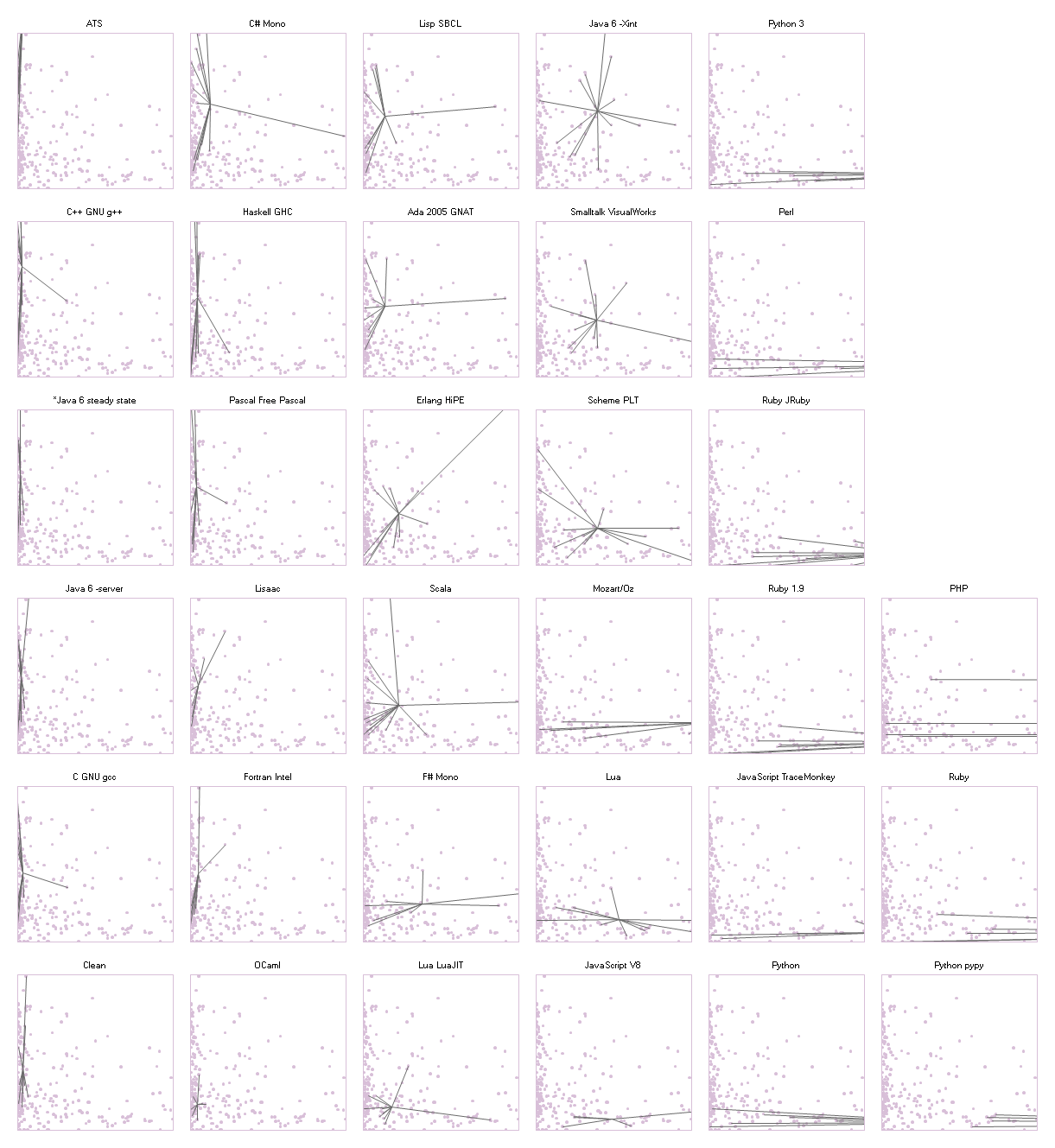
This chart is a treasure of narratives.
The languages in the first column all have tall thin pogo-stick stars. They show strikingly consistent performance, maxing out the CPU times after times, with the exception of one gcc benchmark and one g++ benchmark. Java stands proudly among that group, having earned its place after 10 years of intense research in run-time optimization. Their code sizes, on the other hand, are spread all over.
In the rightmost two columns we find many bushy stars, flat and wide. These are the scripting languages whose communities have not invested as much effort into building optimizing compilers for their language as they have spent tweaking its expressiveness. There are, however, a few spectacular exceptions. Lua, which has always been noted for its good performance among scripting languages, shows a much rounder star in the swatch at (4, 1), counting from the bottom left. Even better, the star of Luajit (3, 1) settles itself in the coveted bottom left corner, next to two academics celebrities Ocaml at (2, 1) and Clean (1, 1).
I am told that writing high-performance programs in Haskell is a bit of a black art, and that the tweaks introduced to boost the performance occupy a lot of code space. Perhaps because of this, the Haskell star at (2, 5) is extremely tall, reaching from the very top the very bottom, while having decent performance over all. Clean is a lazy language just like Haskell, but its star is much more compact, especially in code size, as if a huge effort of optimization had paid off and that it is now possible to write performance code naturally in Clean.
Both Python (5, 1) and Ruby (5, 3) can claim many of the smallest programs in the collection, but so does Firefox 3.5's JavaScript (5, 2). Yet, only the V8 implementation of JavaScript (4, 1) can make a claim at having reliable good performance. Its star has very few points though. It will remain to be seen whether it can maintain its good profile as more benchmarks gets implemented.
No, it does not. In the following chart, the ordering is the same as in the large chart. Languages which include functional features such as lambda, map, and tail call optimization are highlighted in green. The C and C++ compilers are in blue. The greens are spread all over, with more presence in the left (top and bottom) than on the right. Ultimately the first factor of performance is the maturity of the implementation.
I used a data table from The Game's website for the charts above (you will need to copy/paste that page into a csv file.) The code to generate the charts runs in PLT Scheme (MzScheme) v4.1.5.
Despite it not having a particularly remarkable spot on this performance chart, I code in PLT Scheme because it has a fantastic macro system. I also have wrists problems, so coding in Scheme lets me use my ergonomic editor DivaScheme.
The Benchmark Game spends a lot of efforts justifying itself against claims that the benchmarks are always flawed and that the whole exercise is pointless. I don't think it is. In fact, I've found that The Game is remarkably effective at predicting which forum hosts programmers annoyed at the slowness of their language, and that's good enough for me.
I was happy to find that in addition to speed The Game also publishes a source-code-size metric for each benchmark programs in each language. Thanks to this The Game let us at explore a fascinating aspect of programming language design: the tension that exist between expressiveness and performance. It is this tension that gives the expression "higher-level programming language" a pejorative connotation. When you are coding this high, you might be writing beautiful code, but you are so far away from the hardware you can't possibly get good performance, right?
If you drew the benchmark results on an XY chart you could name the four corners. The fast but verbose languages would cluster at the top left. Let's call them system languages. The elegantly concise but sluggish languages would cluster at the bottom right. Let's call them script languages. On the top right you would find the obsolete languages. That is, languages which have since been outclassed by newer languages, unless they offer some quirky attraction that is not captured by the data here. And finally, in the bottom left corner you would find probably nothing, since this is the space of the ideal language, the one which is at the same time fast and short and a joy to use.
Each pinkish dot in this chart comes from one language implementing one benchmark solution, so there are 429 dots, minus a few missing implementations. Both axes show multipliers of worsening from best. That is, if a particular solution is not the best one, the axis show how many times worse it is when compared to the best. The barrier of dots on the left side means that it is common to have many solutions near the best performer. On the right side and beyond it, there are a number of distant points which are clipped out of view by the edge.
The distribution of pink points is more uniform along the Y axis (verbosity) than along the X (slowness), suggesting that the world has not hit a wall in the progression of the expressiveness of programming languages the way it has with performance.
Like many scientific datasets, the data coming from The Computer Language Benchmark Game is rich in shapes, insight and stories. In order to retain as much of the shape as possible, it is critical to avoid calculating averages, as averages tend to smooth over the data and hide interesting sources of variation. The average function does to numbers what Gaussian blur does to pictures. Avoid it if you want to see the edges.
One such source of variation that attracted my curiosity was dependability: how well does the language performs across a variety of tasks, such as those composing the benchmark suite? A language might be concise most of the time, but if once a month a quirk of the language forces the code to be five times as large as what it ought to be, it's a problem.
In order to show dependability, and to avoid relying on averages and standard deviations, I drew star charts in the following manner. Take, for example, the benchmarks for the programming language Scala, which is a mix of functional programming and Java that runs on the JVM. Starting with the previous chart and its 429 dots, I added a gray line from the XY position of each Scala benchmark to the position of the overall average of all the Scala programs.
The center of the star is Scala's average performance, and the branches shoot out to the individual benchmarks. The resulting shape says something about Scala. On the X axis (slowness), the points often come close to the left wall, showing that Scala can take advantage of the optimizations done by the JVM. But the performance is not consistent, and in one case the performance is all the way to the right. On the Y axis (code size), we see that most of its scores are amongst the background crowd, but some of the faster benchmarks might have needed convolutions to reach the speed they have, including the one data point off the chart high above.
The next chart arranges the entire collection of the 33 programming languages available at The Computer Language Benchmark Game into a 6x6 grid. The chart is a so-called 'small multiples' design: each swatch in the grid has the same axes in the same scales as each other. It's the same setup as the one for Scala that we just saw. The 429 dots in the background are the same throughout. The intent is to make it easy to compare the shape of the star between languages (across the page), and against the general trend (in the background).
The swatch of the languages are grouped into columns according to their overall performance. Thus the fastest languages are in the first column on the left and the slowest are on the right. Within each column the swatches are sorted by average code size, with the best one at the bottom. In this way, the disposition of the grid mimics the axes within the swatches.
This chart is a treasure of narratives.
The languages in the first column all have tall thin pogo-stick stars. They show strikingly consistent performance, maxing out the CPU times after times, with the exception of one gcc benchmark and one g++ benchmark. Java stands proudly among that group, having earned its place after 10 years of intense research in run-time optimization. Their code sizes, on the other hand, are spread all over.
In the rightmost two columns we find many bushy stars, flat and wide. These are the scripting languages whose communities have not invested as much effort into building optimizing compilers for their language as they have spent tweaking its expressiveness. There are, however, a few spectacular exceptions. Lua, which has always been noted for its good performance among scripting languages, shows a much rounder star in the swatch at (4, 1), counting from the bottom left. Even better, the star of Luajit (3, 1) settles itself in the coveted bottom left corner, next to two academics celebrities Ocaml at (2, 1) and Clean (1, 1).
I am told that writing high-performance programs in Haskell is a bit of a black art, and that the tweaks introduced to boost the performance occupy a lot of code space. Perhaps because of this, the Haskell star at (2, 5) is extremely tall, reaching from the very top the very bottom, while having decent performance over all. Clean is a lazy language just like Haskell, but its star is much more compact, especially in code size, as if a huge effort of optimization had paid off and that it is now possible to write performance code naturally in Clean.
Both Python (5, 1) and Ruby (5, 3) can claim many of the smallest programs in the collection, but so does Firefox 3.5's JavaScript (5, 2). Yet, only the V8 implementation of JavaScript (4, 1) can make a claim at having reliable good performance. Its star has very few points though. It will remain to be seen whether it can maintain its good profile as more benchmarks gets implemented.
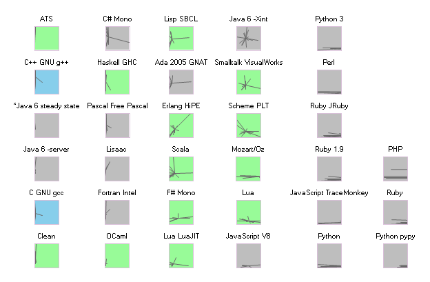
Does introducing functional features kill performance?
No, it does not. In the following chart, the ordering is the same as in the large chart. Languages which include functional features such as lambda, map, and tail call optimization are highlighted in green. The C and C++ compilers are in blue. The greens are spread all over, with more presence in the left (top and bottom) than on the right. Ultimately the first factor of performance is the maturity of the implementation.
Source code
I used a data table from The Game's website for the charts above (you will need to copy/paste that page into a csv file.) The code to generate the charts runs in PLT Scheme (MzScheme) v4.1.5.
Despite it not having a particularly remarkable spot on this performance chart, I code in PLT Scheme because it has a fantastic macro system. I also have wrists problems, so coding in Scheme lets me use my ergonomic editor DivaScheme.
Monday, May 25, 2009
Hypothesis: edit wars have a lot of edits, but few editors
I put today's blog post on Kiran Jonnalagadda's Blog, instead of here. It is an interesting small chart based on Kiran's expiration of Wikipedia's edit patterns.

Friday, May 22, 2009
How would you like to be paid, Mr. Journalist?
I've been wanting to create an alternative way for bloggers to earn money aside from advertisement, because I believe that advertisement is a corrupting force in the modern world. An article that is worth reading does not necessarily draw advertisement, and so socially important subjects become underrepresented. This is the reason why, I believe, there is a business section and a car section in the New York Times, but no "world peace" section, and no "news in anticorporate activism" section.
I also worry that without income from full-page advertisers (which do not exist online) or from classified ads (which became free thanks to Craig's List), neither the print press nor bloggers will have a budget to fund large investigative journalism efforts. It would be unfortunate to see the fourth branch become yet weaker than it already is.
My idea is to create a Firefox plug-in which automatically keeps track of the articles you are reading, and then distribute a fixed monthly sum to their authors in proportion to how much of their writings you have read. If you say that all the writing you consume on the Internet is worth $10/month to you, then that is the amount the plug-in distributes.
The keys to make this work are:
This just one idea. Another idea is that of Spot Us which is uses The Point (as above) to raise funding for individual articles. Nobody knows where they paycheck of journalists will come from in the future. However, the urgency of finding a way is certainly highlighted by the recent row of newspaper bankruptcies.
I also worry that without income from full-page advertisers (which do not exist online) or from classified ads (which became free thanks to Craig's List), neither the print press nor bloggers will have a budget to fund large investigative journalism efforts. It would be unfortunate to see the fourth branch become yet weaker than it already is.
My idea is to create a Firefox plug-in which automatically keeps track of the articles you are reading, and then distribute a fixed monthly sum to their authors in proportion to how much of their writings you have read. If you say that all the writing you consume on the Internet is worth $10/month to you, then that is the amount the plug-in distributes.
The keys to make this work are:
- The interface has to be super low overhead. People dislike being forced to consider values and prices constantly, which is why they prefer unlimited long-distance plans, unlimited Internet, and owning a car to than renting by the hour from Zipcar or Communauto (even though the latter is cheaper). When you think "I could speak with my mom for another five minutes, but is it really worth 1$ to me?," it is clear you would prefer to be thinking about the mom than the 1$. This is why, I believe, micro-payments are failing, and why the plug-in should not allocate 10 cent per article or some such. In addition, choosing which author is worthy of a donation and who isn't is also overhead, which is why the plug-in should keep track of your reading habits in the background.
- The money should be pledged at the moment when you finish reading the article, but it should not be collected until the author comes and claims it. This is an approach similar to that of the group activism site The Point, where people pledge to send money or do an action, but to do so only when enough people have pledged to reach a tipping point that guarantees that there will be an impact. Waiting for the author's claim also ensures that the middleman cannot be accused of hoarding the money. This sort of accusation happened, for instance, to the Russian Organization for Multimedia & Digital Systems (ROMS) which is the governmental entity responsible for distributing the copyright fees collected by AllOfMP3.
- A community site needs to be created to match articles to their authors, so that authorship disputes may be resolved in a way that is satisfactory for the users of the plug-in.
This just one idea. Another idea is that of Spot Us which is uses The Point (as above) to raise funding for individual articles. Nobody knows where they paycheck of journalists will come from in the future. However, the urgency of finding a way is certainly highlighted by the recent row of newspaper bankruptcies.
Tuesday, May 5, 2009
How long is it going to last?
New Scientist magazine recently published a ridiculous chart, with Comic Network aesthetic, bold colors and fat radial lines exploding outwards. Unfortunately, it entirely missed the reason why we make charts: to communicate an argument by using our eye's ability to compare amounts across a page.
Moreover, below the chartjunk lay an important story about resource depletion on our small planet. This story deserved to be told, and so I did. I drew a cleaned and clear version, containing the same data as the original. Here it is. (click on the image to embiggen.)
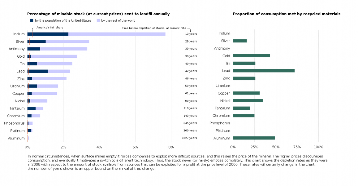
The chart above is my version, and the New Scientist's original is below.

The theory about resource depletion comes from Hubbert's Peak. The theory about chartjunk comes from Tufte's groundbreaking, beautiful, and expensive books (all three of them), as well as from Rafe M.J. Donahue's outstanding free course notes on information design. America's fair share was computed according to one particular definition of 'fair', namely, the current world consumption times the percentage of the world's population living in the US.
Moreover, below the chartjunk lay an important story about resource depletion on our small planet. This story deserved to be told, and so I did. I drew a cleaned and clear version, containing the same data as the original. Here it is. (click on the image to embiggen.)
The chart above is my version, and the New Scientist's original is below.
The theory about resource depletion comes from Hubbert's Peak. The theory about chartjunk comes from Tufte's groundbreaking, beautiful, and expensive books (all three of them), as well as from Rafe M.J. Donahue's outstanding free course notes on information design. America's fair share was computed according to one particular definition of 'fair', namely, the current world consumption times the percentage of the world's population living in the US.
Subscribe to:
Posts (Atom)